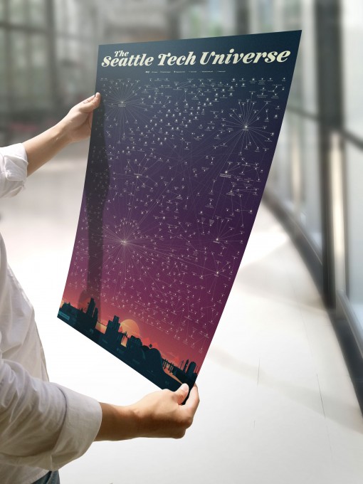
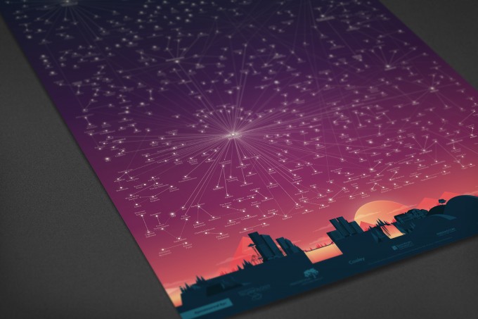
Today, after eight months, we get to introduce the Seattle Tech Universe Map, an update of WTIA’s 2007 Puget Sound Tech Universe Map. The original depicted the genealogy of local tech companies as a solar system. Major tech companies like Microsoft, McCaw Cellular, and Boeing represented suns surrounded by orbits of tech companies as planets that their former employees helped found. This new version, designed by Killer Infographics, features constellations instead of suns.
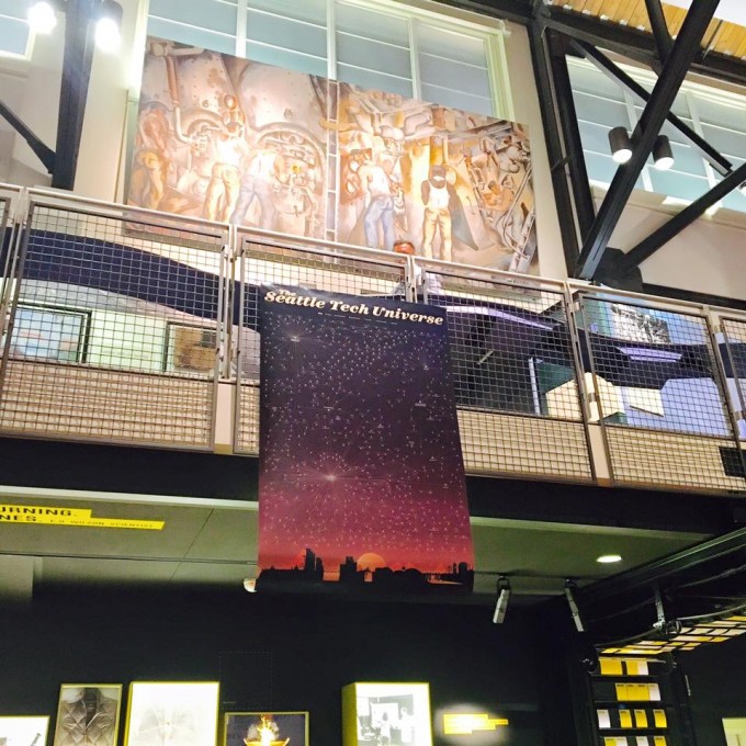
Despite being nearly a decade old, the iconic map has been widely used to convey the richness of our tech industry. It hangs at the MOHAI and in state legislators’ offices. This past November, it was featured in a TEDx talkon innovation ecosystems. Just last weekend, someone said to me, “You work for WTIA? When are you going to update the Tech Universe Map?”.The map has been long overdue for an update.
As head of marketing at WTIA, I soon came to realize that even though people don’t always know what WTIA does, many know we did do the Tech Universe Map. And if I had to choose one project with wide ranging appeal, it would be to update the 2007 map. For over a year, Madrona Venture Group had been trying to update the map on its own. This past spring, we joined forces.
This is the story behind mapping the stars in the updated Seattle Tech Universe Map
Why update the map
The map was first created because a Virginia Tech researcher came to WTIA with ready data. A lot has changed since 2007. In the past eight years, more than 450 billion in wealth as measured by market cap and M&A transactions has been created in the region. More than 2,100 new tech companies have been created. During this time frame, more than 58.4 billion has been invested in companies in Washington. The diversity of the kinds of technologies created here has increased; in particular, we have more cloud computing, data analytics, online retail, and mobile application companies.
But people do not look at the map as a database for research on the region. Instead, they look at it to be awed. “Whoa” is the most common response I hear when people see the map for the first time. We know there’s a lot more to be wowed by now, which is why we wanted to update the map.
It’s not just the number or range of tech companies that needed to be updated. This newer version also reflects the use of more newly available technologies and new partnerships. The first map took two years to complete. We did this one in one-third the time. The original map was like a Census of the tech industry in 2007. It not only captured the data of the time, but also how we defined technology back then. To fit a universe onto a 24” x 36” poster means making judgement calls on what should get included and what won’t. Although WTIA has many tech service companies as members, they didn’t make the map because we decided our focus would be on companies with at least a seed round completed in big data, mobile apps, software, online retail, and gaming. We didn’t include Healthcare IT, telcos, ISPs, etc. Check out the other differences between the 2007 and 2015 maps in these write-ups by Madrona and Xconomy.
The people behind making the map
Technology hasn’t found a way to replace human judgement yet. Many people contributed to the updating of this map. After trying to validate research through Mechanical Turk, Erika Shaffer of Madrona came to WTIA and proposed working together to update the map. She found an Excel guru and researcher in Spencer Cheng, a MBA student at MIT, and we hired him for the summer.
You know you’ve got a good thing when you’re able to gather over a dozen tech community leaders with only a week’s notice to discuss updating the map. Ken Myer, the CEO of WTIA who led the original effort, participated. Others included Ed Lazowska, UW; Dave McShea, Perkins Coie, Geir Hansen, Silicon Valley Bank, John Robertson,Cooley; John Cook, GeekWire; Leonard Garfield, MOHAI; Tayloe Washburn, Northeastern University; Rebecca Lovell, City of Seattle; Wistar Kay, Washington State Department of Commerce; Dan Waggoner, Davis Wright Tremaine, Craig Sherman, WSGR. These people were later invited to provide feedback on the initial research. Over time we also met with Dan Rosen, Chris DeVore and of course Tom Alberg and Tim Porter from Madrona and Michael Schutzler from WTIA.
As a trained historian, I’m familiar with having to cull through many different historical sources to weave a story. The same was very much true for this project. We pulled lists from the original project, websites, GeekWire,PItchbook, ReferenceUSA, and then we went to work to create the links we needed for the map. In 2007, not many people were on LinkedIn. This time, Cheng led a group of WTIA interns in scouring LinkedIn and other free online sources for the career history on founders. UPS student Alex Tomes spent a solid 6 weeks just pouring over LinkedIn and he was later joined by UW students David Wong and Cathy Chen. By the time Cheng ended his three-month contract in July, he had built a massive spreadsheet with elaborate linked worksheets.
With the initial stage of research done, we set out to find the illustrator. Erika and I had independently talked to Balliett and Killer Infographics about updating the Tech Universe. Her passion for the project shined through. Balliett shared how when she left All Star Directories to start her own tech company, Doug Brown, the CEO, pointed out where All Star Directories was on the map and said one day, her company would be connected to it.
Killer Infographics helped us realize we needed to simplify the story and instead of suns with multiple generational rings, the story of companies’ genealogies could be told more simply as constellations. As a relative newcomer to the tech industry, I served mainly as the cheerleader, project manager, and intern coordinator. We held smaller group meetings where leaders debated, reminisced and helped each other remember who was who and what happened to what company and which companies should and shouldn’t be included.
We hung a large printed draft version at Madrona and asked people to come by and mark up the map with their comments. Madrona hosted a happy hour gathering to collect more feedback. Erika rigorously conducted QA after each draft. By the time we were done, I had to manually write out all the companies and their relationships again to accurately capture all the updates we had made to the actual illustration.
No matter how much new technology helps us get more efficient, people still drove this project.
There are more stories behind the stars
WTIA’s CEO Michael Schutzler often says, “Our tech industry is not about devices or software. It’s about people.” When I look at the stars and the constellations on the map, I see the paths of individuals who helped build our tech community. And I know there are so many more stories to be discovered in this universe.
There are stories you just can’t see from this map. You wouldn’t know that we have–at 90,000–more software engineers than any other metro area or that each of those software engineers generates seven non-tech jobs in the State of Washington or that there are over 8,500 tech companies across our state.
This updated illustration intends to spark more conversation, engagement, and curiosity about our tech community. WTIA and Madrona are perfect collaborators–a non-profit serving the tech industry and a VC firm betting on innovative startups. Our partnership reflects our shared goal of attracting tech talent, entrepreneurs, and investors to what we view as the greatest tech hub in the world.
To support updating the graphic, University of Washington, Davis Wright Tremaine, Cooley, Perkins Coie andWilson Sonsini Goodrich & Rosati quickly signed on as financial sponsors. The next step is to undertake research for an interactive map to be built on Tableau, which has committed to helping us create that more powerful, continuously updated version.
As you view this updated edition of the Seattle Tech Universe, you’ll undoubtedly find mistakes. Please email us attechuniverse@washingtontechnology.org to let us know. Although we won’t be able to revise it in this illustrated version, we’ll address it when we build out the online, interactive map. Feel free to contact us if you’re interested in volunteering or sponsoring.
As you view this updated edition of the Seattle Tech Universe, you’ll undoubtedly find mistakes. Please email us at techuniverse@washingtontechnology.org to let us know. Although we won’t be able to revise it in this illustrated version, we’ll address it when we build out the online, interactive map. Feel free to contact us if you’re interested in volunteering or sponsoring.


